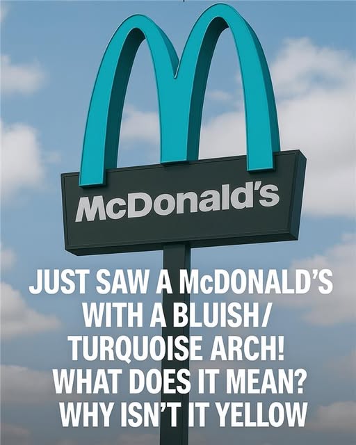
Nestled in the heart of northern Arizona, Sedona is renowned worldwide for its striking red rock formations, sweeping desert landscapes, and vibrant arts scene. Tourists and locals alike are drawn to the area for hiking, spiritual retreats, and the unique interplay of color, light, and nature that seems to define the region. Amid this spectacular scenery, one would expect a fast-food chain to feel out of place, yet there exists a McDonald’s that has become something of a local curiosity and minor landmark. Unlike the familiar golden arches that are instantly recognizable across the globe, Sedona’s McDonald’s displays arches in a distinctive turquoise hue. For visitors encountering it for the first time, the sight is both jarring and charming, a familiar brand adapted to harmonize with the extraordinary natural beauty of its surroundings. The change in color is more than aesthetic—it reflects the city’s deliberate approach to preserving visual harmony in a landscape considered sacred by many, including the Indigenous communities whose ancestors have inhabited the region for centuries.
When McDonald’s first planned to open a location in Sedona in 1993, city planners and officials faced a dilemma. The typical bright yellow arches, emblematic of the fast-food giant, would stand in stark contrast to the surrounding red rocks, potentially disrupting the visual flow that the city had carefully nurtured. Sedona enforces strict building guidelines and zoning regulations specifically designed to protect its natural vistas from visual clutter and architectural intrusion. Officials were concerned that such a high-profile, brightly colored structure could undermine the city’s aesthetic values and its reputation as a destination for nature lovers and artists. These considerations led to discussions with McDonald’s corporate planners, who were willing to entertain the idea of a compromise, recognizing that adherence to local guidelines was essential for community acceptance. What could have been a standard installation instead became a collaboration between a global corporation and a local government deeply committed to preserving beauty.
The decision-making process was meticulous and thoughtful. City officials, designers, and McDonald’s representatives explored multiple options, considering everything from muted yellows and earth tones to more daring choices that could enhance the building rather than clash with it. After months of consultation, turquoise was selected as the optimal color for the arches. This shade offered a striking contrast to the red rock but was also complementary, evoking the sky and natural mineral tones often seen in southwestern landscapes. Turquoise, a color long associated with Native American art and jewelry, brought a culturally resonant element to the design, even as it represented an international corporate brand. The choice symbolized Sedona’s ability to balance modernity with respect for heritage, nature, and aesthetics. McDonald’s corporate team embraced the idea, recognizing that the unusual arches would not only satisfy city regulations but also create a unique selling point and an attraction in its own right.
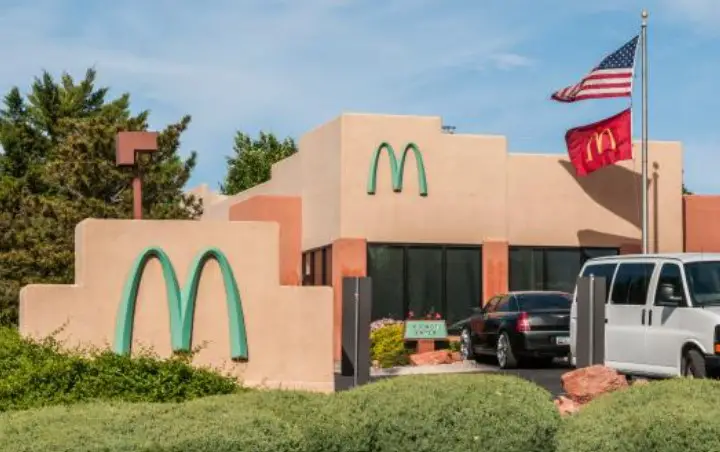
When the turquoise arches were finally installed, reactions ranged from amusement to admiration. Local residents praised the compromise, noting that the familiar symbol had been transformed into something uniquely Sedona, a reflection of the city’s values and pride in its surroundings. Artists, photographers, and tourists began capturing the McDonald’s in images, often juxtaposing the bright turquoise arches with the natural reds, oranges, and browns of the surrounding cliffs. What might have been a mundane fast-food location became a visual landmark, blending urban functionality with environmental sensitivity. The building itself was designed to be low-profile, with natural stone accents and muted exterior colors that further harmonized with the terrain. In doing so, the McDonald’s became more than a restaurant; it was a symbol of intentional urban design and thoughtful integration into the landscape.
Over the years, the turquoise arches have taken on symbolic and cultural significance. They demonstrate the city’s commitment to balancing modern development with environmental stewardship and aesthetic integrity. Visitors from across the country and around the world stop not only to eat but also to photograph the arches, marveling at how a global corporate icon can be adapted to local context. The McDonald’s has been featured in travel articles, photography guides, and social media posts, reinforcing Sedona’s image as a city that values harmony with nature. Tour guides often point out the location as an example of successful collaboration between municipal authorities and corporate interests, highlighting how adherence to local design principles can produce a result that is both functional and culturally respectful. The turquoise arches, though unconventional, have become an emblem of Sedona’s identity, illustrating how even commercial enterprises can contribute to a city’s aesthetic legacy.
Today, Sedona’s turquoise-arched McDonald’s stands as a testament to thoughtful design and civic collaboration. Its status as a local landmark continues to grow, drawing visitors who might otherwise overlook a fast-food chain in favor of more natural attractions. More than three decades after its installation, the arches serve as a reminder that even global corporations can adapt to local priorities and that beauty, harmony, and respect for the environment can guide architectural choices. For Sedona residents, the building embodies a playful yet meaningful balance between tradition and modernity. For travelers, it offers a memorable visual cue, an unexpected twist on a familiar brand, and a story about how cities can protect their unique character while welcoming the conveniences of contemporary life. In a broader sense, it highlights the possibilities for design interventions that honor place, culture, and history—showing that even a McDonald’s can be a work of community-conscious artistry.